Postmortem - Lunar Ace
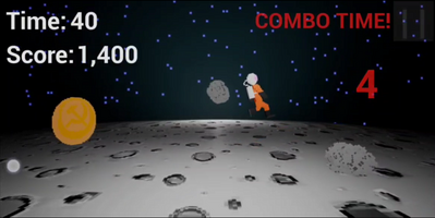
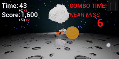
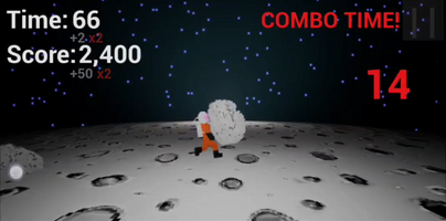
So one month ago, I decided to create a mobile game in Unreal Engine 5. This is how it went.

- Why Unreal?
The Unreal Engine is often underrated as an indie development tool. I've lost count of how many talks I have been to where people would joke about "killing an ant with a cannon", or about having the project spiral out of control in search of realistic art styles and other such nonsense. And yes, while there is some truth in that, people really don't seem to grasp how big - or how little - an Unreal Engine game may end up being. Tech matters little if you can't properly scope your project to begin with. Hell, I've been down a rabbit hole once trying to force complex materials and realistic shadows into the first goddamn GameMaker Studio. Some people have even succeded in doing so and much more.
Unreal, however, is also where I'm most comfortable. As a kid, I would mess around with level design tools on games whenever they were available, and the first Unreal Engine was also the first 3D tool I've ever used, back in the late 90's. It's where I picked up some of the workflow that is still present in Unreal 5 as well. I'm used to the Z axis being up/down, and to all the little quirks that put people off once they're used to another engine. I know how it feels because I felt the same when I had to work with Unity back in college. UE5 is just easier for me. So with this in mind, I set myself a limit of 30 days and decided that I would complete a fun game, ideally before the end of the year. So around December 10th, I began development on what I, back then, called Space Race.
- The game idea
To keep things simple and doable, and also assuming I should leave some space for my future self to feature creep a little bit down the line, I opted to create a game type which I really don't enjoy very much: an infinite runner. Ew, I know. Even typing it out feels... unholy or something. But please, bear with me, as this would also be an opportunity to find a way to exercise my game design skills and try to find some fun in this genre of game. Little did I know, back then, that I would not be able to stick the landing on the whole runner thing.
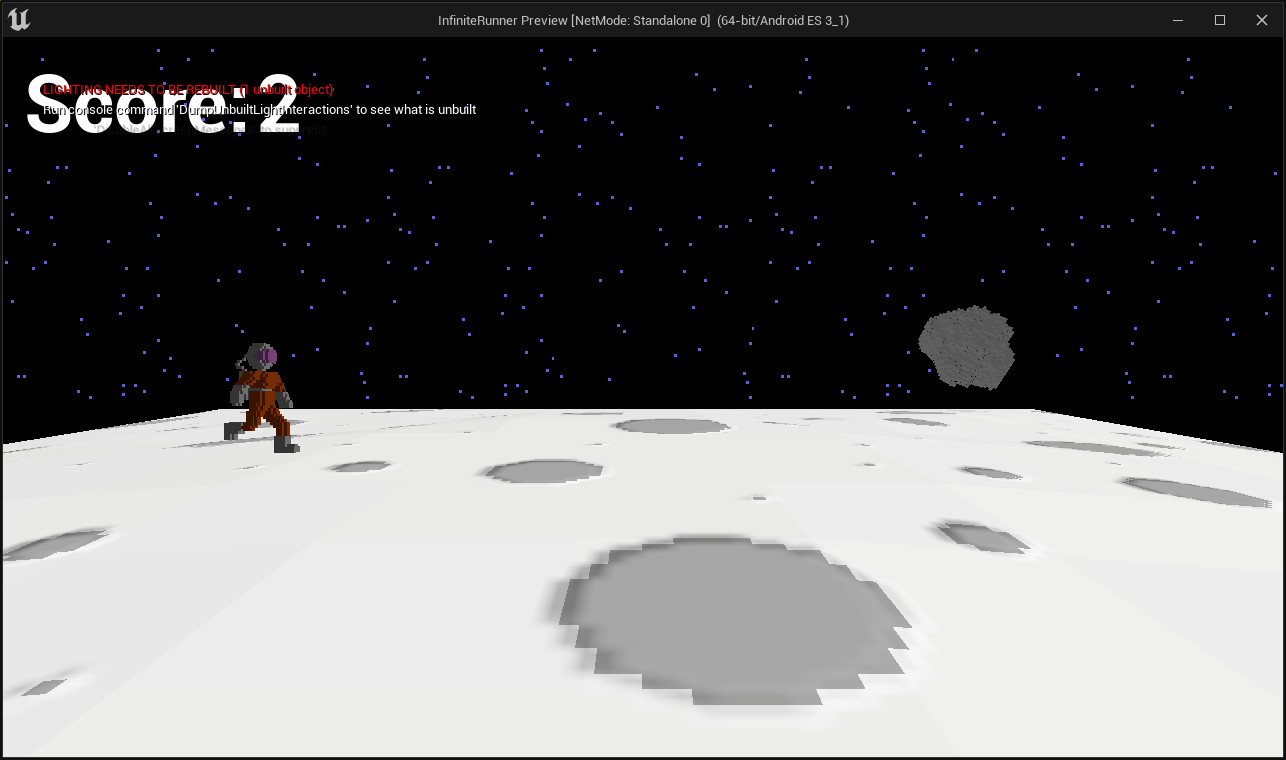
The game consisted of two objects: the player and an obstacle. This obstacle would move towards the player, and the player would have to jump at the right time to avoid it. A bit of code here and there to animate the player model (by rotating between static meshes really fast so it definitely looks animated), a simple jump function, an object firing said obstacle towards the player; a simple material hooked to a panner to give the sensation of movement on the ground and voilá: I was ready for my first test on mobile.
So this is what it looked like in the editor:
And this is what it looked like on my phone:
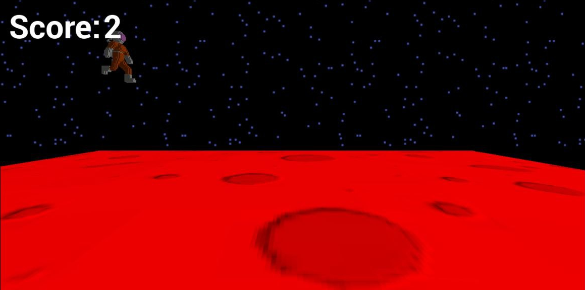
So yeah, My game wanted really badly to be set on Mars. I had no idea what was going on at the time and why this was happening. I did some snooping online, but ended up fixing it up by upgrading to Unreal Engine 5.1 (which is usually not recommended in the middle of the project, but eh, it worked). So with the clock ticking down, I didn't really want to waste any more time on this and just moved on.
- Adding the art
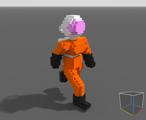
I wasn't feeling like spending a couple days just drawing pixel art either (which is usually all I can do in regards to art), so instead I fired up MagicaVoxel and quickly put together a cosmonaut-looking thing. This allowed me to create two frames of animation, by the magic process of making one and inverting it on the horizontal axis. After adding one more frame (which also became two), I had a rough walk cycle for my character. It didn't look great, but for the time being I was satisfied with it and moved on, though I ended up losing my mind with how bad it looked and fixed it a couple days later. I had some previous experience with MagicaVoxel, having used it to model yet another cosmonaut for Jupiter Diving, though that's a 2D game in which I used some sprite stacking shenanigans to achieve fake 3D on GameMaker Studio. This was my first time animating anything voxel.
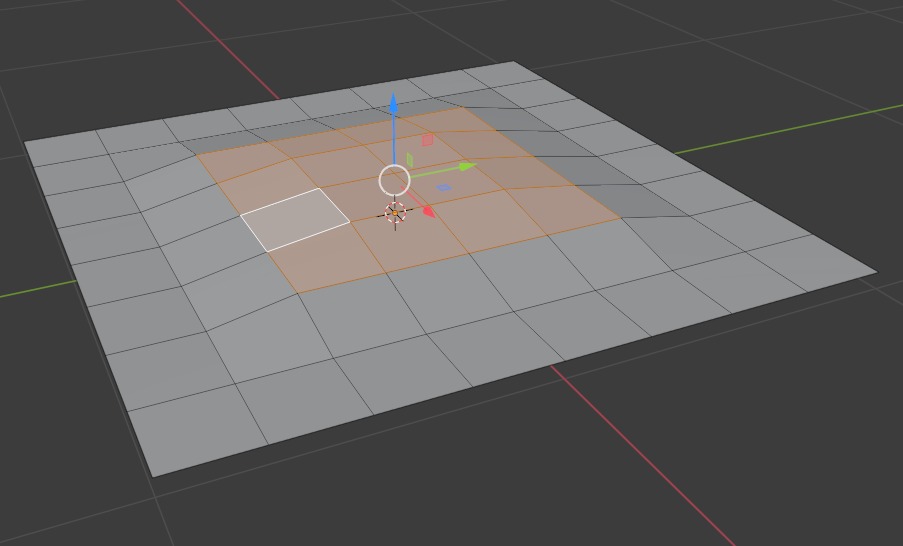
As for the Floor, I've tried a couple different things. Leaving it flat just didn't look cool, and since lighting is very limited (as in, pretty much non-existant) on mobile, I wouldn't be able to abuse it to fake a curve. By the way, even though I haven't yet been to the Moon, I presume we can't see it's curvature at eye level, but it feels like we should since it's so much smaller than the Earth. So I really wanted to have this curvature on the ground, and so I went to Blender, created a plane, divided it many times and started pulling vertices up.
It looked awful.
On the next step, I took out part of a standard Blender sphere, which also didn't look much better: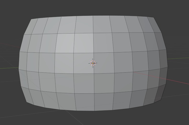
Even though I was in a bit of a hurry, I wasn't really satisfied with how any of those solutions were turning out in-game. I ended up going back to the sphere, taking out it's top and flattening it. Now, in-engine, it didn't look much better either, because of how the default mapping was done in Blender. if you look at it from above in the editor, it looks like this:
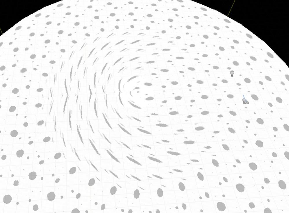
However, with the right camera angle and the right lighting and positioning of the player... Well, you can see how it looks in the game. Again, far from perfect, but definitely serviceable. When I have more free time, I'll definitely look up how to properly map materials to stuff so I can fix the UV and have it looking a little better.
- "Finishing" the game
So with the art kinda sorted out, all I had to do was finish up the game. So I changed the object that would "shoot" rocks at the player to only shoot if there are no rocks in the game, which only happens when the game starts. Once an existing rock hits an off-screen barrier, it receives a new rotation speed and direction and is sent back to the "firing" object, which keeps changing places as the game goes on. This saves up on resources, which is imperative in mobile (and console) game development. Without it, I assume the game would eventually start chugging. This is also where I started experimenting a little bit. The rocks coming from the side of the screen got boring really fast, so I moved the spawner object to the background of the game and turned it to face the player. It looked cool, so I added lateral movement to the player and dodging rocks was decent, but still not very engaging. It also caused some issues with the rocks getting too close to the camera and covering the entire screen, so I added some translucency. With the code effortlessly working, I was free to focus on design, at last. So to make the game more engaging I did what every dev worth their salt would in this situation: added some coins.
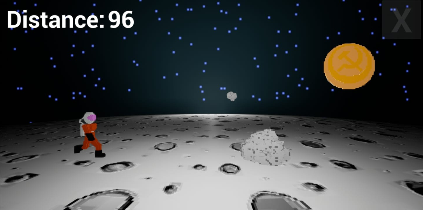
As you can see in the corner of the screen, the game still had this concept of distance. You'd reach 0 to win, dodging rocks and grabbing coins that did nothing. And I wasn't playing the game. It had all of the elements a game needs, such as win and lose conditions, points, challenge, but it just wasn't... You know... there. I would playtest it a lot, but I wasn't really playing it for fun at all, and this is always a bad sign.
- Finding the fun
I was exhausted. I had been working around ten hours a day on this project, even more on some days, and it wasn't amounting to much in the end. It all worked, but was not fun. So I stepped back. Took a shower, ate something and asked myself: how would this game have to be for me to enjoy it? The answer: Resident Evil: The Mercenaries 3D.
Ok, so I know this sounds kinda crazy, but bear with me. I'm a big fan of the Mercenaries modes in older Resident Evil titles. The devs take out all of the puzzle-solving and focus 100% on the action, where the player just needs to kill enemies and make combos to earn points and more time, in which you make even more combos and so on. Now that's engaging, and so I had a realization about my game. Instead of just dodging rocks, I'd give the player an incentive to go near them: the Near Miss, which earns you as many points as grabbing a coin and also adds up to your Combo meter. And so the current iteration of the game was born.
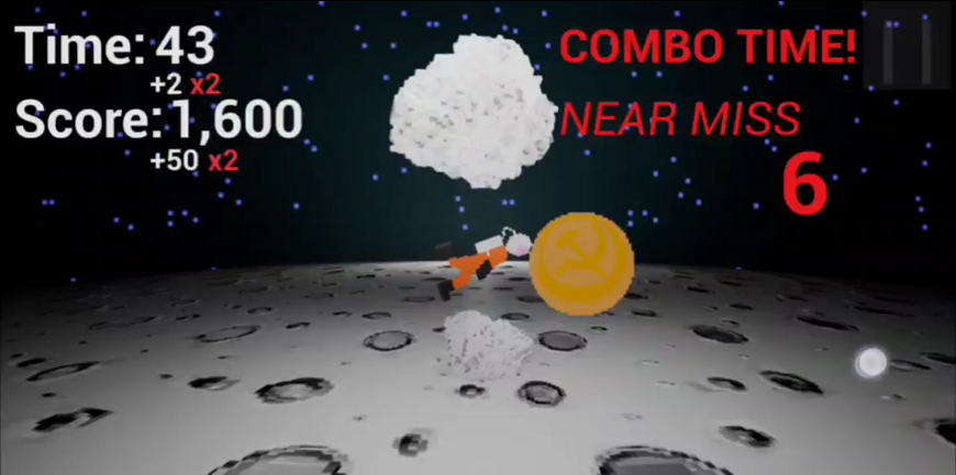
I did some adjusting to the UI, painted some stuff red and made it shaky to make it more impactful, and sent the game to my poor friends who couldn't stand me annoying them over instant message anymore. And the feedback was awesome. People were finally playing the game for fun. We even started competing for score, and I got requests to add a leaderboard to the game - something I've yet to do. Implementing all those changes was very easy as well. Just added a second hitbox to the flying rocks, a combo counter that triggers a combo if it gets accessed twice in a short span of time, and then I already found myself tweaking values up and down, trying to find the sweet spot of balance. I also fixed a bug in the scoring system, which wasn't multiplying the multipliers and made it get saved to the game's title screen. And this as it.
Now all I had left to do was some polishing, like adding movement to other parts of the UI, properly anchoring buttons to the corners of the screen, and so on. For the main menu, I decided to add a very cool picture of the Moon to the background of the game. So I compiled it one final time for Android and...
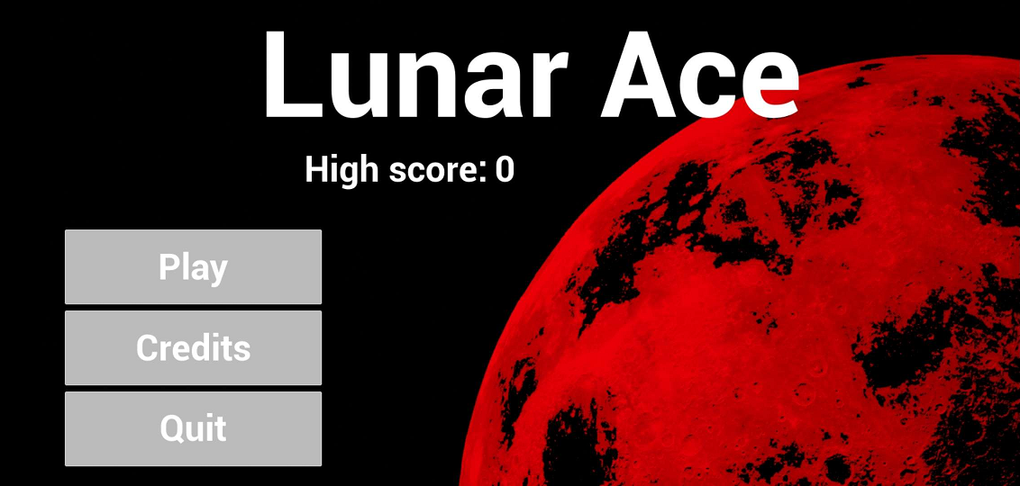
The red Moon issue was back, but now on a 2D texture in the background of the main menu. Now, as cool as this looks, it definitely didn't fit with the theme of the game, and there wasn't a newer version of the engine for me to port to again, so I sat down and started looking into this. This isn't a very well known issue, mainly due to the fact that not that many people are creating Android games on Unreal I guess. One fella said that he fixed this issue by adding more RAM to his computer, which definitely isn't an option for me at the moment as well. In the end, I fiddled with the importing process of 2D textures, adding Paper2D settings to it, resizing, and so on, and one of those things eventually did the trick. Sorry if you're running into this, found this post and I don't have a solution for you, but building for Android takes time and I couldn't afford to make a build at every little change.
Anyways, with the issue fixed, I recentered some stuff on the main menu, added some slight camera motion to it, fixed some buttons that were broken, and uploaded the final version of the game here. Friends soon started sending me their scores and competing for points amongst themselves.
- The future of Lunar Ace
For now, I'm focusing on other projects and looking to develop other skills, but in the future I with to come back to this project and give it a proper treatment. The ground work is already laid out, with all of the code being clean, organized and well documented.
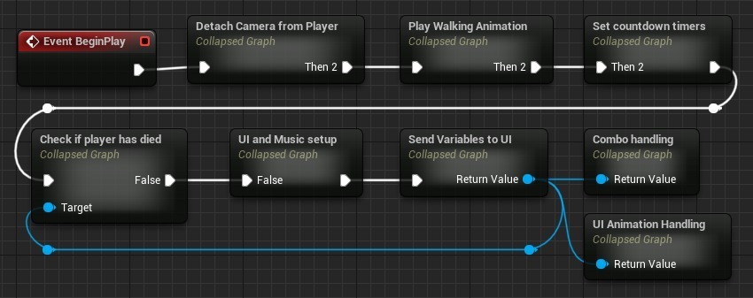
Obviously I could still improve on this, but again, I was satisfied with the point I've stopped on. There's much to improve in the game as well, such as refining mechanics, scoring and such; adding an actual 3D model instead of the janky player model I've cobbled together in Magica, adding sound effects and music (which is something that's present in the code but I ended up not adding because I was used to testing it listening to my own music), as well as adding more content in the form of more player characters, more obstacles, maybe different planets, etc. With proper improvements, I feel like this game could even become financially viable, though that's still a long ways away.
Oh yeah, and the entire game ended up being around just 69Mb in size, which is nice!
Files
Get Lunar Ace
Lunar Ace
Tiny mobile game created as an exercise in learning new tools. Created in Unreal Engine 5
| Status | Released |
| Author | Juliano Reis |
| Genre | Action |
| Tags | Arcade, combos, Singleplayer, Space |
Leave a comment
Log in with itch.io to leave a comment.